With thanks to my current project, I finally have a chance to build a Xaml based Windows Store application. On the whole, I think the platform is great but it seems like a complete reboot of the developer ecosystem. Favourite tools like Reflector and WPF Snoop don't have a home and it reminds me of the first few years when .NET first came out. It's going to take a little while for us all to fully understand the change and how to make the most of it.
For today I thought it would be fun to start a new series of posts related to all the gotchas I've discovered working with Windows.UI.Xaml. Today's gotcha, Visibility.
One of the first observations you'll find working with Xaml for Windows store applications is that it is not WPF. WPF has matured into the System.Windows namespace over the last six years. Windows.UI.Xaml is brand-new -- it looks like WPF but it has some interesting changes.
Today's change: Visibility.
Under WPF, the System.Windows.Visibility enumeration has three possible values:
| Visible | Display the element. |
| Hidden | Do not display the element, but reserve space for the element in layout. |
| Collapsed | Do not display the element, and do not reserve space for it in layout. |
Visible seems straight forward enough, but the difference between Hidden and Collapsed is significant. The difference is shown using the Rectangle in this example:
<Window x:Class="Blog.VisibilityHiddenDemo.MainWindow"
        xmlns="http://schemas.microsoft.com/winfx/2006/xaml/presentation"
        xmlns:x="http://schemas.microsoft.com/winfx/2006/xaml"
        Title="MainWindow" Height="350" Width="525">
    <StackPanel Orientation="Vertical">

        <Rectangle Width="100" Height="100" Fill="Green"
                   Visibility="Visible" />
        <TextBlock HorizontalAlignment="Center">Some Content</TextBlock>

    </StackPanel>
</Window>
When the Rectangle is Visible it appears on the screen as expected.
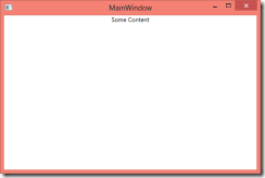
When the Rectangle is Hidden it doesn't appear, but it still takes up space.
When the Rectangle is Collapsed it's at though it never existed.
For applications that target Windows RT, Windows.UI.Xaml.Visibility has only two possible values:
| Visible | Display the element. |
| Collapsed | Do not display the element, and do not reserve space for it in layout. |
It makes we wonder why the folks at Microsoft decided to drop "Hidden" from the API. Ultimately, someone lost the debate and now we're left with an enumeration that is familiar to developers but is even more awkward that the original. Strange indeed.
So what does it mean that we have no Hidden? In the majority of cases, toggling between Visible and Collapsed is exactly what you want. But occasionally, you do want to remove something from the UI without changing the layout. For example, showing a button on the screen only when required.
So we don't have Hidden in Windows.UI.Xaml. Here's a few alternatives:
Opacity / IsHitTestVisible
One alternative to Hidden is to change the element’s opacity to zero thereby making it transparent. But beware, transparent objects are still present on the screen and can be interacted with, so if you’re hiding an interactive element such as a button, you’ll also want to set the IsHitTestVisible property to False.
Alternate Layouts
Rather than relying on the Hidden to preserve layout, another alternative is to use a different layout. Here are a few hacks that I’ve used:
Canvas Control
You can use a Canvas control and set the Canvas.Left and Canvas.Top attached properties on the children controls to position the controls exactly where you want. This seems a little heavy-handed and might only work if the content has a fixed size.
Relative positioning using Margins
The Grid control has a simple, dirty hack: if you don’t specify the Grid.Row or Grid.Column attached properties the element will default to the first column and row. You can achieve a form of relative positioning by putting multiple controls in the first position and then use margins to offset their position.
<Grid>
   <Button Width="50" Visibility="Hidden">
      <Image Source="/images/back.png" />
   </Button>
   <TextBlock Margin="55,0,0,0"
              Text="Text offset by margin" />
</Grid>
Grid-based layout
Another approach to preserving layout when Hidden is to explicitly define the layout. Again, heavy-handed if all you need is collapsed visibility.
<Grid>
   <Grid.ColumnDefinitions>
        <ColumnDefinition Width="50" />
        <ColumnDefinition />
   </Grid.ColumnDefinitions>

   <Button Grid.Column="0" Visibility="Hidden">
     <Image Source="/images/back.png" />
   </Button>

   <TextBlock Grid.Column="1"
        Text="Text in 2nd column" />
</Grid>
Well, that’s all for now. I’ll continue to post finds on Windows 8 Xaml under the WinRT hash tag.
Happy coding!


No comments:
Post a Comment